Heatmaps are an effective method for representing large swaths of data at once and uncovering underlying patterns within the data. Probably the most common use in biology is within high-throughput genomics experiments, such as RNA-seq. In RNA-seq experiments, one may want to uncover molecular patterns characteristic of a particular biological background, or track changes in gene expression across time. Whenever I make a heatmap, I always get the same question: Why are you using Z-scores for the gene expression data? Why not use fold changes? This blog post is intended as a blog post to summarize my answers to some common questions. I will be using examples relevant to RNA-seq, but the principles are applicable to other data types.
In the following examples, I will be borrowing heavily from a fantastic blog post by BIOMICKWATSON, titled "You probably don't understand heatmaps". The purpose of my blog post is not to steal the thunder of BIOMICKWATSON, but rather to offer a summary of questions I have encountered and an easy place to access this information (rather than me trying to explain myself over and over again).
Why Z-score?
Z-scoring (or standard scoring) of data essentially boils down to going gene by, calculating the mean of the the values across all samples for the gene, then determining how many standard deviations the actual value is from the mean. This is also commonly referred to as "mean centering." This is done using the following formula:
$$ {z = (x – μ) / σ} $$Let's break this down a little:
- x: A given gene expression measurement (ex: 40)
- μ: The mean of gene expression values across samples for a given gene (ex: 25)
- σ: The standard deviation across samples for a given gene (ex: 5)
- z: The outcoming z-score for each gene expression measurement
So in this example, the output z-score for this particular gene in this sample would be:
$$ {3 = (40 – 25) / 5} $$So this gene having a z = 3 means its expression is 3 standard deviations above the mean. Pretty impressive, right?
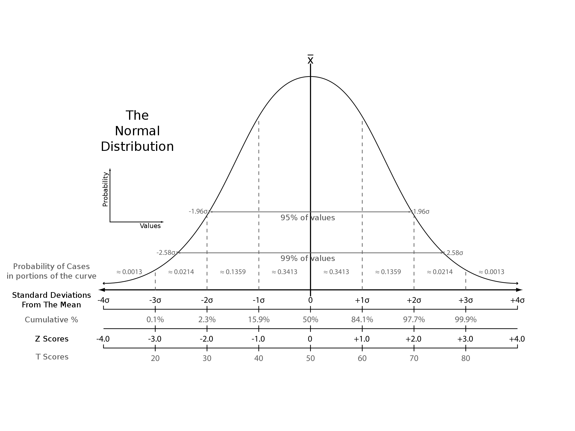
Scoring values along a normal distribution. Source: Wikipedia
But Z-scores make no sense! Why not log2(fold change)?
I get this response a lot, and I get it, Z-scoring gene expression may not be super intuitive. And I will admit, while Z-scores give you significance and direction, using solely Z-score misses an important piece of information: magnitude. But to plot a heatmap using using log2(fold change) also misses significance!
In cases where magnitude of change is important, I recommend people use a volcano plot to visualize their data. This captures magnitude, direction, and statistical significance, but will lose information like population variability (maybe have your experimental samples have one signature and the other half have another). You also cannot plot expression over a time course. But let's talk more about why Z-scores should be used in heatmaps, that's why we're here after all!
Z-scores make each gene comparable to another
Let's consider the following example from the aforementioned blog.
In this first example, we have two gene expression patterns before any kind of gene normalization has been applied:
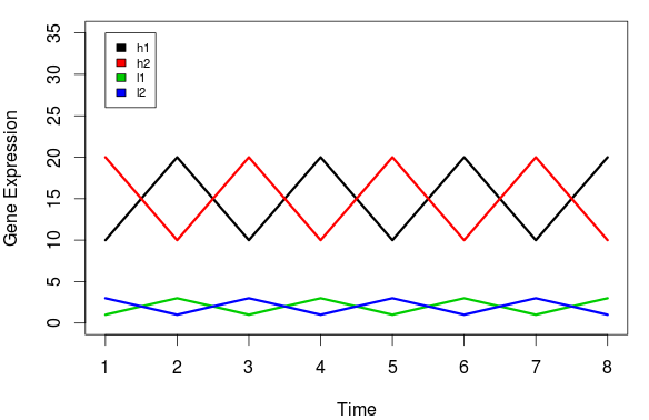
Source: BIOMICKWATSON
h1 and l1 both follow the sample gene expression pattern. They appear to be under the same or similar regulation. Therefore, when performing unbiased clustering of these signatures, we would expect h1 and l1 to cluster together and h2 and l1 to cluster together. But let's look at the clustering outcome:
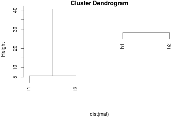
Source: BIOMICKWATSON
This result is a bit unexpected. Why did this happen? These patterns that should have emerged were hidden by the different magnitudes of expression, and so the clustering algorithm thought h1 and h2 shared a profile. This might lead researchers to make false conclusions concerning their data. Maybe based on this they determine h1 and h2 are in a pathway related to their disease and design drugs to target these two genes, when really the actually pathway involved h1 and h2 and they should have designed a different drug or one drug may have targeted both genes in a shared pathway and billions of dollars of R&D money was wasted instead.
Here is how the clustering should look when the data have been scaled:
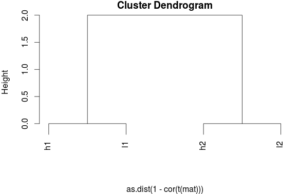
Source: BIOMICKWATSON
I don't care about clustering genes. Why should I still use Z-scores?
Z-scores avoid swamping out patterns in the data. Let's take the following case for example:
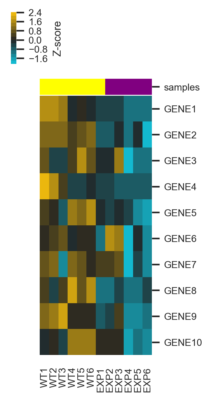
In the first case, everything looks pretty good. It seems like all gene expression levels decrease between wild-type and experimental cases, and this is easy to see when the data has been normalized in this manner. But let's look at the same exact dataset, but without normalization. One might say only GENE1 is really seeing any changes in gene expression, but nothing else is really going on.
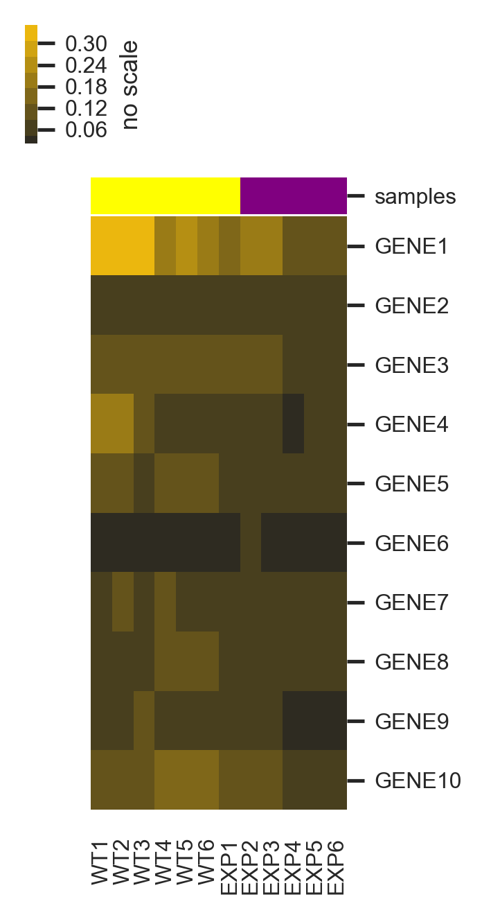
When scaling has been applied, one can observe that all these genes appear to be under similar transcriptional control and interesting biology can be uncovered that would otherwise appear to be hidden.
To look at the code I used to create the last two figures, please refer here.
References
1. BIOMICKWATSON. You probably don't understand heatmaps. http://www.opiniomics.org/you-probably-dont-understand-heatmaps/. Accessed: 2019-04-19.2. Statistics How To. Z-Score: Definition, Formula and Calculation. https://www.statisticshowto.datasciencecentral.com/probability-and-statistics/z-score/#zscoreformulas. Accessed: 2019-04-19.
3. Wikipedia. Standard Score. https://en.wikipedia.org/wiki/Standard_score. Accessed: 2019-04-19.